Updating front magazine cover

Planning and analysising masthead
Updating masthead - I have put a drop shadow and inner shadow onto my masthead to make stand out. I have put a texture effect benhind the text, to create and emphasise the genre being action, and it looks like broken glass behind it. I have chosen the colour of black and orange to be the main colours throughout the front cover, so I decided to have the strapline in an orange font. I have looked at the conventions of the film magazine Total Film, advertising SALT and I will use similair conventions.

  • Digg
  • Del.icio.us
  • StumbleUpon
  • Reddit
  • RSS

Magazine Annotations

  • Digg
  • Del.icio.us
  • StumbleUpon
  • Reddit
  • RSS

Magazine Annotations

  • Digg
  • Del.icio.us
  • StumbleUpon
  • Reddit
  • RSS

Action Plan Film Magazine

  • Digg
  • Del.icio.us
  • StumbleUpon
  • Reddit
  • RSS

Defining your audience (images, age, gender)

  • Digg
  • Del.icio.us
  • StumbleUpon
  • Reddit
  • RSS

Image planning sheet

  • Digg
  • Del.icio.us
  • StumbleUpon
  • Reddit
  • RSS

How are films funded?

  • Digg
  • Del.icio.us
  • StumbleUpon
  • Reddit
  • RSS

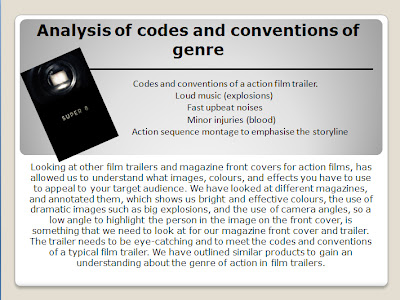
Anaylsis of codes and conventions

  • Digg
  • Del.icio.us
  • StumbleUpon
  • Reddit
  • RSS

How will you be creative?

Foundation portfolio: How I was creative

  • Digg
  • Del.icio.us
  • StumbleUpon
  • Reddit
  • RSS

Updating front cover

  • Digg
  • Del.icio.us
  • StumbleUpon
  • Reddit
  • RSS

Background of genre

  • Digg
  • Del.icio.us
  • StumbleUpon
  • Reddit
  • RSS

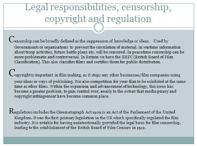
Legal responsibilities

  • Digg
  • Del.icio.us
  • StumbleUpon
  • Reddit
  • RSS

When would your film be exhibited in cinemas? Why?

  • Digg
  • Del.icio.us
  • StumbleUpon
  • Reddit
  • RSS

Methods of distribution

  • Digg
  • Del.icio.us
  • StumbleUpon
  • Reddit
  • RSS

G324 Additional Questions

Additional Questions needed:

1. What type of images would appeal to you on an action film magazine front cover?
     - Direct mode of address
     - Indirect mode of address

From this response, what image would appeal to you?
     - A powerful image of an action pose
     - A vulnerable image of an action pose
    
     - A public place, with additional people blurred out, focused on main character.
     - A public place, with just the character and random other people.

     - A close-up image of the character, so the facial expression is powerful.
     - A medium- close up image of the character, so you can see the costume.
     - A long shot image, to show the location, costume and facial expression.

Other images that would appeal to you, give an example:

..........................................................................................

  • Digg
  • Del.icio.us
  • StumbleUpon
  • Reddit
  • RSS

Questionnaire and relevant answers

  • Digg
  • Del.icio.us
  • StumbleUpon
  • Reddit
  • RSS

Magazine Initial thoughts

  • Digg
  • Del.icio.us
  • StumbleUpon
  • Reddit
  • RSS